Web Shop Manager - Color Theory In Web Design
In its entirety, Color Theory is an extremely complicated concept that encompasses many different ideas. Essentially it is a guide to color mixing and the impacts that certain colors have subconsciously on the human mind. While it wouldn’t hurt to learn as much as you can about it, this particular post will focus solely on this one aspect of Color Theory in web design and how it is relevant to a high quality website design.
It goes without saying that one of the most important parts of any design is the color used throughout. While creating a design, you should always have the target audience in mind; what kind of message is this website trying to send? How should someone feel while looking through the individual pages? Before delving into the actual emotional responses that are evoked by specific colors, it is important to understand the relationships that colors have with each other.
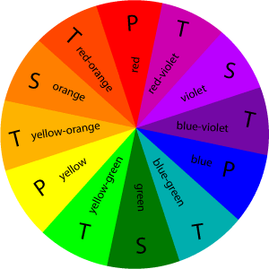
Red, blue, and yellow are the primary colors. These can be mixed to create every other color on the color wheel
Secondary colors consist of primary colors mixed together; these are purple, orange, and green
All of the colors in between, like blue-green and red-orange are known as tertiary colors
Complimentary colors are the colors on the wheel that sit directly opposite each other and go together well, while analogous colors are located next to each other. Analogous colors don’t automatically look terrible together, but being so similar will provide little to no contrast
The colors used on your website are the first impression you give to users, so you want to make sure you’re creating the right emotional response. There are 3 groups of colors to consider when breaking them down into emotional categories. Warm colors will bring about energetic and joyful emotions in users, and consist of reds, oranges, and yellows. Cool colors are perfect for establishing a professional, corporate feeling while visiting a site. Blues, purples, and greens are examples of cool colors. Understanding these basic concepts behind the psychology of color recognition is the first step in deciding on a color concept for your ideal website design.
Emotional Responses to Specific Colors
Every color has the ability to create certain emotions in the viewer, but not all of them are necessarily good emotions. For the most part, each and every color has positive and negative connotations that go along with it. Here are some very basic explanations:
Red is a powerful color that represents strength and passion. It can create feelings of energy and excitement, or conversely, anger and aggressiveness
Orange plays on the same kinds of emotions as red, but is much less aggressive. It is an upbeat and cheerful color that is known to generate a higher level of mental activity in the viewer. Traditionally, orange can also be seen as a symbol for deceit and lack of trust
Yellow is an inarguably exuberant color. It instantly conjures thoughts of sunshine and summer, leaving the viewer with feelings of refreshment and energy. However, a more dull yellow can represent laziness and cowardice
Green creates a sense of safety in peoples' minds. It represents nature, health, and well being; it is for this exact reason that quite a few spas or hospitals will utilize green accents in their designs. Green also subconsciously represents greed and jealousy
Blue will more often than not evoke a general sense of calm and peacefulness. Blue is a very common color used in banks or large corporate companies because it provides a sense of stability and trust. Certain darker shades of blue can symbolize depression or apathy as well
Purple is another color that can have extremely soothing effects. It represents sophistication and spirituality, and can be perfect to create a sense of wonder, as brighter purples have an almost magical quality. Much like shades of blue, dark purples can intensify feelings of sadness
White, while not technically part of the color wheel, can still be used to evoke an emotional response. It is widely regarded as a representation of purity, and can promote feelings of trust. It can also be seen as harsh and cold and create an uninviting environment for visitors
Black represents depth and power. Good usage of black can give your website a more professional feel and bring about feelings of sophistication and steadiness. Obviously, black is also associated with quite a few negative concepts such as death and sorrow as well
Real World Examples
High Flow Performance: We designed this automotive eCommerce website using a primarily black, red, and grey design. In this particular industry it is important to showcase power and reliability, a lot of trust is put into the quality and functionality of an automobile. Red is a warm color that represents energy and power, while black and grey represent strength and dependability.

BEDSLIDE - Client Testimonial
"The best thing out of everything was that our sales went up. The new site had a better design, the checkout process was better, and ultimately achieved all of our goals. That site has been up for a year and a half and we’re very happy with it, it’s still awesome." - Jake Plappert