Jun 10, 2016 | 3 Min Read
Optimizing Your Images for Retina Screens: An SEO Guide
Optimizing Your Images For Retina Screen Resolution
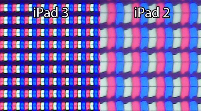
If you’ve noticed how incredibly clear images have become over the last few years on smartphones, tablets, and monitors, then you can thank a little something called Retina display.
Almost all devices today have such a high resolution and pixel density that you can’t detect the individual pixels when looking at images. And this is great – as long as your website is prepared for it.
However, if your images aren’t optimized for retina screens, then they’ll come across as blurry and amateur.
Here we’ve laid out a few simple tips to help you get clear images again so that you can be ready when someone views your ecommerce website on a device that has Retina display.
#1: Use CSS.
When you don’t have a theme that automatically sizes your images, then you’ll want to write a little CSS to ensure that when a picture is loaded, it will be clear. Set the images height and width to about 50% because you’ll want to size your image for a width 2x what is needed for best results.
Be careful when using full resolution because the larger the image, the slower your site will be (and we all know that customers will leave a site that is slow to upload).
#2: Find the right plugin.
If you utilize WordPress for your website, and you aren’t comfortable writing code (or you simply don’t want to), then you can install a version of WP Retina 2X. This will ensure that you’re providing your visitors with crisp images no matter what device they’re using.
However, you’ll also want to look at old and new images to ensure that the plugin is doing its job. While it’s a highly recommended plugin and is utilized by people from all walks of professional web design, it’s still a good rule of thumb to investigate what your finished site looks like on retina devices once it’s installed.
Even with the plugin, it’s still a good idea to set your default media settings to the image size you use the most. And then when you upload a new image, make sure it is 2x that size for retina screens. This way, your images will look great on devices that don’t utilize retina (yet), as well as screens that do.
#3: Don’t forget to keep it responsive.
When changing image sizes, be mindful that all of them must be optimized for the mobile web. It can be easy to get caught up in making your site perfect for the screen you’re currently working on, but be sure once you’ve hit publish, that it also looks great on a smartphone and tablet.
While there are other methods to make your images retina ready, the two listed here are straightforward and effective. And even if you only dabble in web design, you should be able to execute with them with no problem. And don’t forget to test your site once you’ve made changes to the CSS or added a new plugin.

Get in touch with us
Reach out to us for any inquiries or support, and let’s connect!
More On Related Topic
Explore our highlighted blogs for the latest insights and trends in the industry.
Implementing Mobile Web Design: A Beginner’s 101 Guide
Discussing ecommerce web design and the importance of responsive mobile websites and mobile web design for ecommerce platformsIt’s easy to get overwhelmed when you start implementing a mobile web design as part of your...
Reducing Bounce Rate in Ecommerce: Why It’s Important and How to Fix It
Tips for Reducing the Bounce Rate of Your Ecommerce SiteThe Bounce Rate on your individual website pages is an extremely important metric to keep track of if you are striving to improve your online...
The CPC Math Just Changed: AI Is a Paid Acquisition Channel Now
What a marketing director told us this month: "We're seeing a sharp lift in conversion from sessions we cannot trace. The customer says they 'asked ChatGPT.' Our attribution model has no row for that....
Ready To Grow Your Business?
Ready to grow your aftermarket eCommerce presence and lift conversions across auto, truck, powersports, marine, and more? Connect with
Web Shop Manager for tailored solutions: strategy, platform, and performance in one team.