
Fuel Moto: A Cart and Checkout Rebuild That Lifted Conversion Rate from 15.5% to 17.7%
Fuel Moto sells EFI tuning, exhaust and engine parts and tunes bikes on its own dyno. Their checkout was costing them orders. Our CRO partner Convert48 designed a new cart and checkout, our developers built it, and Convert48 tested it against the old one on 3,952 shoppers.
The result in four numbers
Old checkout (A) against the rebuilt cart and checkout (B), same store, same 10 days.
Source: Convert48 test report for Fuel Moto, July 2024. 3,952 users were randomized 50/50 between control (A) and variant (B); every highlighted metric reached at least 95% confidence.
Separate from the checkout test: migrating to Web Shop Manager increased Fuel Moto’s organic search traffic by 18%.
What was costing them orders
Fuel Moto builds EFI tuning components, exhaust systems and engine parts, and tunes bikes on its own in-house dyno. The brand was strong and the customers were loyal. The leak was in the last two steps before payment.
- The cart sat inside the full store layout. Navigation links and store features surrounded it and pulled shoppers away from finishing the order.
- Payment choices were scattered. Credit card, PayPal and Affirm were all offered, spread across the page, so the next click was unclear.
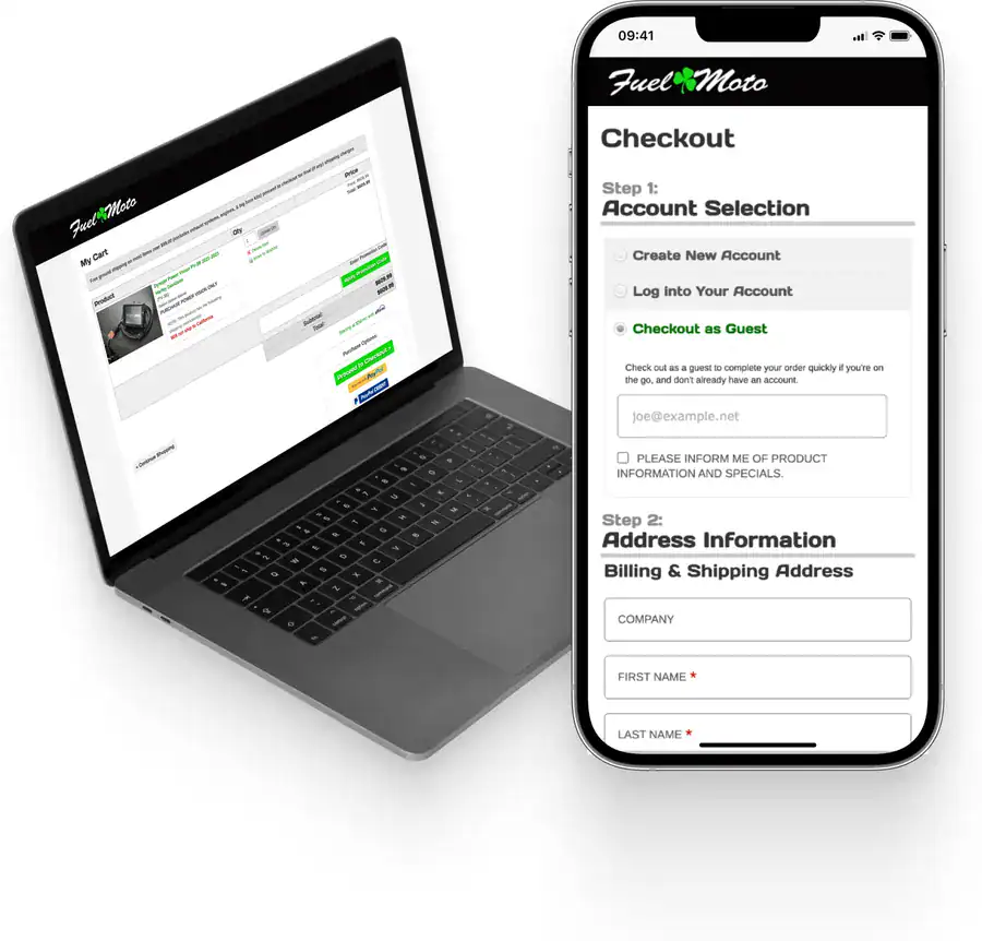
- The checkout form read as long and hard. Small fields, a cramped layout and a text label on everything made a normal form feel like a chore.
What changed
Our CRO partner Convert48 designed the changes around two goals: more shoppers finishing checkout, and more trust in the checkout so they would place larger orders. Our developers built them into the Fuel Moto store.
Cart
- Removed the elements that did nothing to help a shopper finish the order.
- Put the payment options up front so the choice was obvious at a glance.
Checkout form
- Floating labels inside the fields, so the form looks as short as it really is.
- Larger, rounded fields in a single column, easier to read and to tap.
- Clear visual separation between checkout steps.
- One standard set of font sizes for legibility.
How it was tested
Convert48 ran it as a straight A/B test: they set up the split, launched it and tracked the results. 3,952 shoppers were randomized into the old checkout (A) and the rebuilt one (B), 50/50, for 10 days. All highlighted results reached at least 95% statistical confidence. Once B won, our developers made it the permanent cart and checkout for every shopper.
The lift showed up on day one and held. On the daily chart from the test report, B never dropped below roughly 15% ahead of A, and peaked near 26% on day four.
Where the lift came from
| Segment | Purchases | Average order value |
|---|---|---|
| All orders | +14.5% | +11.2% |
| Credit card orders | +11.2% | +19.6% |
| Credit card, mobile | +14% | +16% |
| Credit card, desktop | +8% | up to +36% |
- Card purchases rose more on phones than on desktop (+14% against +8%). A simpler form matters most on a small screen.
- PayPal express checkout almost doubled on desktop, with no measurable change on mobile, where the design changes were smaller.
- Bigger orders, especially on desktop. A cleaner checkout made shoppers more comfortable placing larger orders.
About $32,000 in additional revenue over the 10 days. Convert48 projected roughly $1.17 million a year if the rate held; that is a projection, not booked revenue.
What Fuel Moto shoppers see today
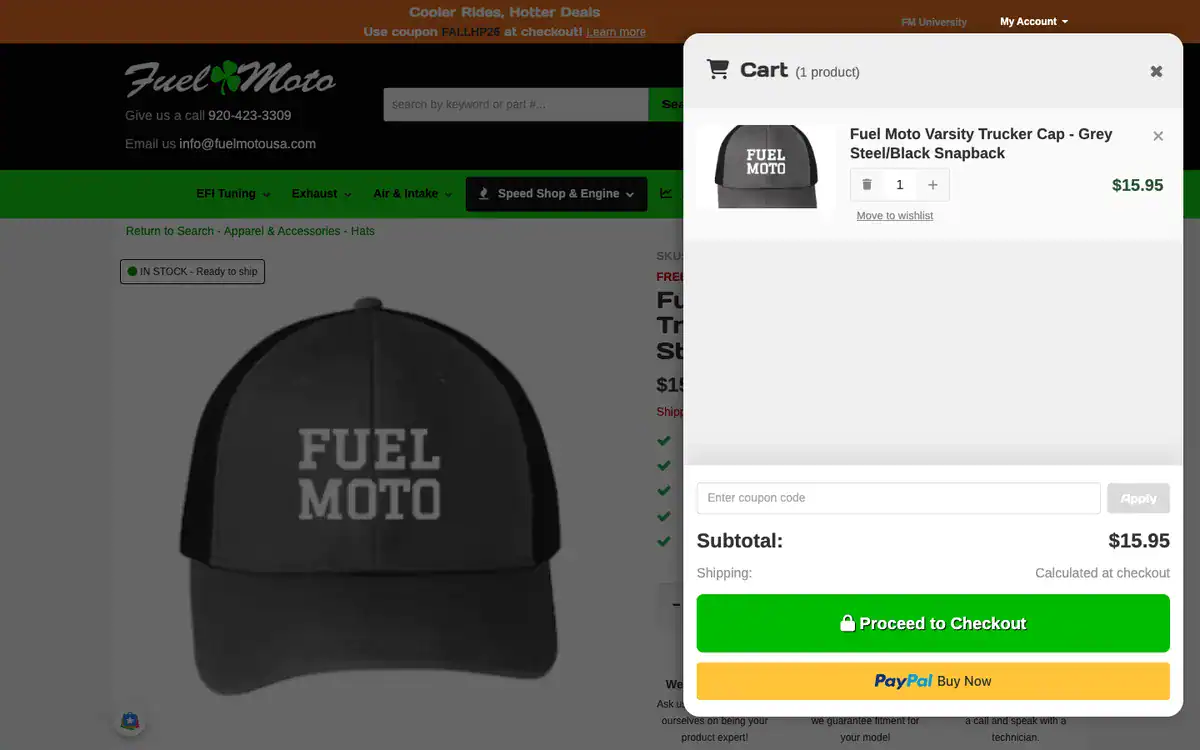
The cart and checkout kept moving after the test. A later Convert48 test brought in a slide-out cart and a new checkout, and that version is now switched on for every shopper. Adding a part now opens a slide-out cart over the page the shopper is already on: the item, quantity, a coupon field and the subtotal, with shipping marked as calculated at checkout, then one green Proceed to Checkout button and a PayPal button underneath (pictured at the top of this page). Checkout runs in two columns on desktop, contact and address on the left and the order summary on the right, and in a single column on phones.
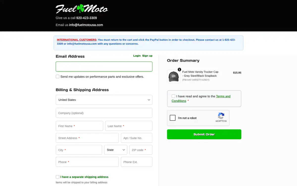
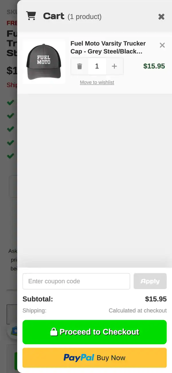
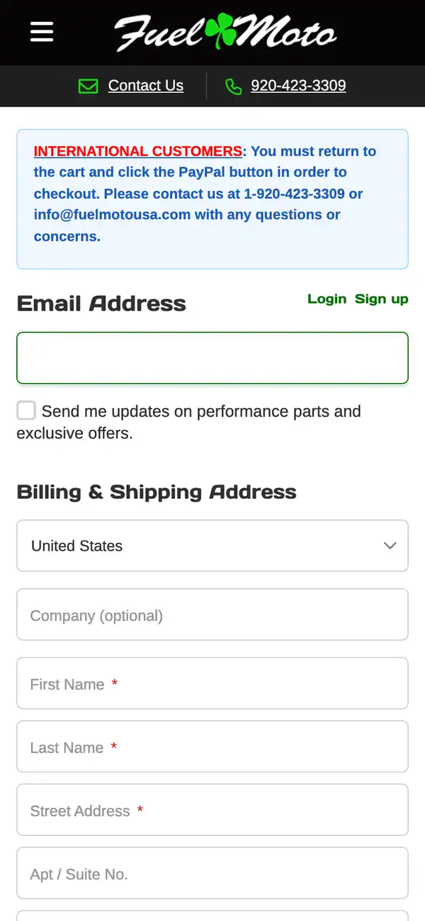
Screenshots taken on fuelmotousa.com on October 7, 2026. No order was placed.
Why it worked
None of this bought more traffic. Fuel Moto got more orders, and larger ones, from shoppers who were already in the cart. Cutting what a shopper has to read and decide in the last two steps took the friction out, and a checkout that looks clean and orderly earned enough trust for people to spend more.
The same work for your store
We are taking this cart and checkout work across other Web Shop Manager stores now: read the funnel data, find where shoppers drop, design the fix, test it against the current version, and ship what wins. If you want to know what your checkout is costing you, talk to us, or see more of our work.

Ready To Grow Your Business?
Ready to grow your aftermarket eCommerce presence and lift conversions across auto, truck, powersports, marine, and more? Connect with
Web Shop Manager for tailored solutions: strategy, platform, and performance in one team.