Jun 8, 2015 | 7 Min Read
6 Proven Checkout & Shopping Cart Conversion Boosters for eCommerce
Get in touch with us
Reach out to us for any inquiries or support, and let’s connect!
eCommerce Conversion Funnels : Reduce Shopping Cart Abandonment
In eCommerce, conversion is one of the most important aspects of your online game once you have your traffic in place.
This blog is the final part in our eCommerce optimization series, and also deals with the final section of your conversion funnel – your shopping cart or ‘checkout’.
While this blog works just fine on its own (checkout optimization is huge – implement everything here and you’ll see conversion improvements right away), we still recommend you go back and take in everything we’ve previously taught on:
Over 80% of potential customers bail at the checkout!
It’s well known to most eCommerce web store owners that cart abandonment is a big problem in ecommerce. It’s frustrating when potential customers come so far down your funnel and not take that final (and most important!) step to becoming a paying customer.
While there are great tactics out there to re-target them with ads, offers and cart abandonment emails, the issue is still not addressed as to why they didn’t buy with you in the first place.
They were obviously interested, so what’s the problem?
Luckily there are a whole bunch of things you can do, they’re not difficult to implement, and we’ve taken the time to research, test and present them for you here.
Try them out and let us know how they work for you!
1) Keep your checkout congruent with your site
We can’t emphasize enough how important this is. Imagine how your potential customer feels when they have been browsing through your store, you’ve been building trust and adding value, they’ve loaded their cart, done the math in their head and made a decision… then they click on the ‘checkout’ button and they’re whisked off to a page that looks nothing like the original site!
Imagine what this does to trust.
Perhaps they were balancing on the decision of parting with a few hundred dollars, or they were looking for reasons not to buy just yet. This is the perfect time for that little voice in their head to say “I don’t know…” and go off to check out your competitors.
Don’t let it happen!
Make sure your checkout page has the same header, footer, background and color scheme as the rest of the site. It should look like your store.
If you do nothing else from this blog, do this. Implementing this one tip will increase your conversions today. Don’t let this one slip.
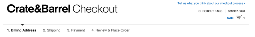
2) Include a progress bar in your checkout sequence
Buying online is a process, and it helps customers to know where they are in that process at all times. They know how many steps they have to go (eliminating the nagging ‘how long will this take?’ doubts from occurring) and reminds them of the steps they have already taken.
It also serves as piece of mind and security to know they are ‘being taken care of’ and are in some sort of organized system, much as they would feel when waiting at a checkout in a store.
This has become standard across many of the big stores in ecommerce, including Amazon and Crate and Barrel, to name just two. People are used to it, so make sure you include it – it works.
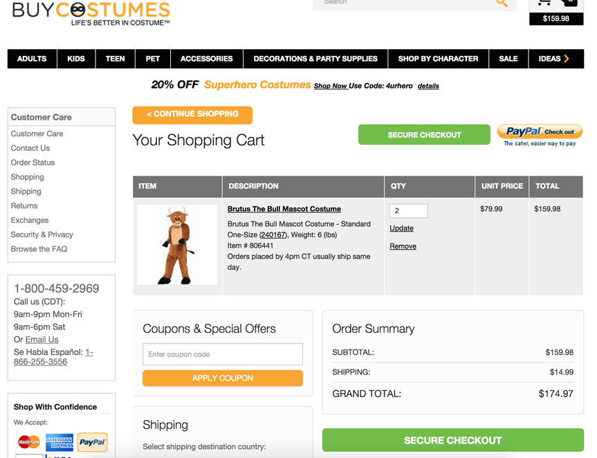
3) Include a shipping calculator
Unless you offer free shipping on all your items, then you will want to include a shipping calculator right there on your shopping cart. It’s natural that people will want to know the total cost of shipping and be able to make their purchase decision right there and then.
Keeping the shipping cost hidden at this point (or tucked away on a ‘shipping rates’ or ‘FAQ’ page) is a perfect excuse for someone to bounce out of your cart to look for it, or worse yet, go over to your competitors whose shipping rates are plain and clear.
4) Try using ‘proceed’ buttons at the top and bottom of your cart
Something that has worked for us in the past is to include a ‘proceed to checkout’ or ‘checkout now’ button at both ends of our shopping cart.
Anything you can do to facilitate a smooth transition through to your checkout page is a good thing, and displaying two buttons on the same page is a great way to emphasize that move to the customer at this stage in the process.
Buycostumes.com are using this to great effect, as are many of the big players in the eCommerce optimization game, such as Zappos and The Disney Store.
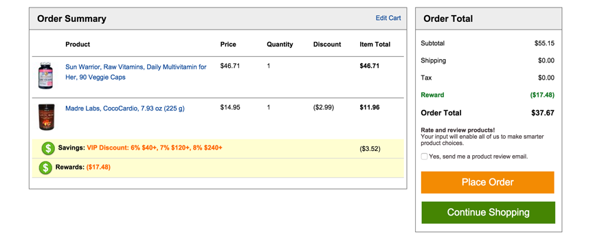
5) Include the product image in the cart
Some stores are still failing to take advantage of providing high-quality images of the products that are about to be purchased in the cart itself. The deal is still not sealed, so stores should do everything they can to guide the buyer through the final step of the process.
Using the original image that attracted the customer in the first place is like a confirmation from both sides of the deal that is about to be done. Don’t give them a chance to forget about or ‘fall out of love’ with the product.
Hold their hand the whole way, show them the product they are about to buy, and get that sale.
Here’s a perfect example from iHerb:
6) Accept as many payment methods as possible
Finally, make sure you have as many options for receiving payment as you can in your cart.
The last thing you want to happen is for a customer to have made a decision to buy, and when they finally pull out their card to pay they find out you only accept PayPal, or you can’t accept their chosen credit card.
This might seem like a basic tip but you would be surprised how many stores we come across who would make so many more sales if they would just provide the right payment options on their cart.
This can be a particularly big problem for UK, Australia and Europe-based stores who are using US-based merchant accounts and payment gateways. Be sure to do your homework on your market and present the options they need.
At the very least you need to make sure you can accept Paypal and all the major credit cards for your market.
The end of the funnel, and the end of the series
The end of your eCommerce funnel is one of the most important parts of your store to optimize, so make sure you pay a lot of attention to this one.
There’s nothing worse than a customer coming all this way with you and dropping the ball at the last moment. The tips we provide here will all give you a noticeable boost in conversions, so make sure you test them out on your store and tell us how they work out for you.
That wraps up the final part of our eCommerce conversion rate optimization series.
If you missed the first 5 parts, go back and check them out, starting here.
Make sure to stick around on the blog to keep up to date with our posts. We have some big things planned for the end of 2015.
Speaking of which, we’d love to know your biggest question about eCommerce.
Leave us a comment in the box below, and we’ll see what we can do to help!

More On Related Topic
Explore our highlighted blogs for the latest insights and trends in the industry.
How to Create Winning Marketing Videos for Your Website Strategy (SEO Tips)
Web Shop Manager - Creating Marketing VideosIf you want to get your business noticed, creating marketing videos and incorporating them into your website marketing strategy can be a worthwhile endeavor. Not only do great marketing videos...
3 Up and Coming Social Media Platforms Your Ideal Customers May Be On
Even if your brand is active on the top forms of social media, you may feel that you're still missing some of your ideal customers. And it's true because they may be checking out...
How to Write SEO Title Tags and Meta Descriptions That Rank
A Guide to Writing Meta Title Tags and Descriptions for SEOWhile there’s been much debate about the importance of meta keyword tags in 2016, some meta tags still play a very solid role in...
Ready To Grow Your Business?
Ready to elevate your aftermarket eCommerce presence and conversions—across auto, truck, powersports, marine, and more? Connect with
Web Shop Manager for tailored solutions: strategy, platform, and performance in one team.