Mar 9, 2015 | 7 Min Read
Ecommerce Conversion Rate Optimization: 7 Home Page Boosters for Higher Sales
Get in touch with us
Reach out to us for any inquiries or support, and let’s connect!
How to increase eCommerce home page optimization with guaranteed conversion boosters
The home page of your ecommerce store is huge for conversions, so optimizing it right should be a top priority for you. Customers expect certain things from an ecommerce home page. They expect it to feature your best products, display your special offers and they go there to consume all information that you have available to them. Make sure to check out Part 2 of our series, sitewide conversion rate boosters 2.
Session capture software has confirmed that whatever it is they are looking for, be it contact details, your returns policy or just to find out what kind of company you are, they will often turn to the home page to find it.
You need a solid, well filled-out, content rich homepage.
Rich homepages win
The richer your homepage, the better.
About 50% of the time, people don’t land directly on your home page. They land on your product pages, your category pages, your blog post or PPC landing pages.
But most visitors end up visiting the home page. It’s just something people do when they visit your store – it’s a hub, and it needs to display the diverse range of content that people are looking for.
Here’s some things you want to include on your homepage:
- A big image banner or scrolling banner
- Category / special offer kicker images
- Featured products
- Testimonials (customer reviews form products sold throughout the store)
- A ‘hello’ video from the owner
- More information / featured product videos
- FAQs
- Special offers
- All the offers you are making, available right there on the homepage
High converting homepage structure
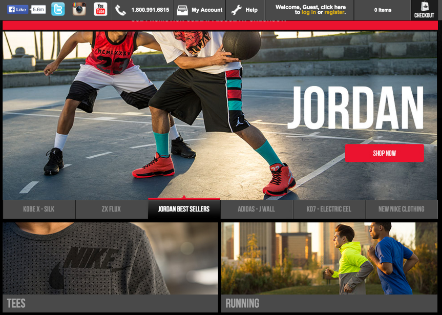
There is a formula out there that is being tested by all the big box ecommerce stores. Stores like Foot Locker, Disney Store and Zappos are testing variations of the following method.
The big box stores are training consumers what an ecommerce store is supposed to look and feel like. Customers will subconsciously think you are a better store if they see these elements that they see on the bigger stores.
Besides that, they spend a lot of money split testing and there’s a reason for it – what they are doing works.
Main banner and category kickers
When you check out their stores, the first thing you will notice is a big banner and category kickers above the fold.
Some use rotators and some don’t. They don’t always improve conversion rates, it just gives customers more information on the page to consume. Sometimes a single, solid banner is best. You should test this yourself and see what works best in your industry. An example of the classic banner / kickers model is being used with great success over at iHerb.com.
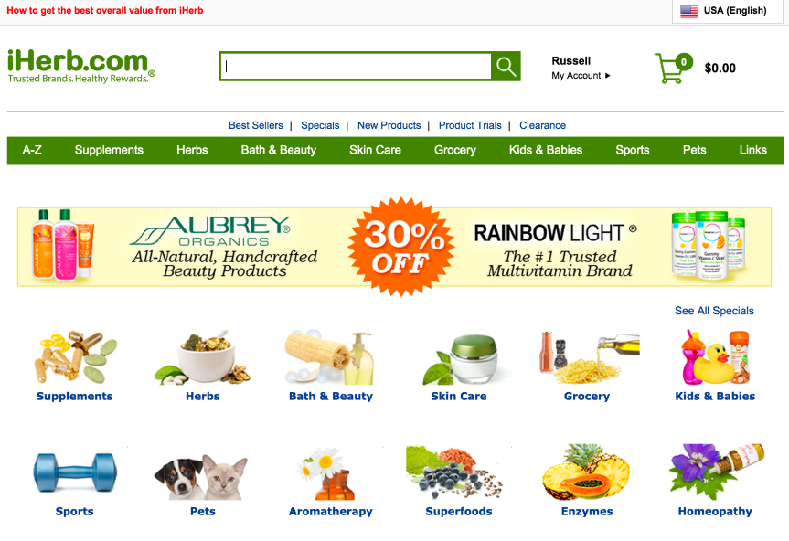
You can play with the layout as you like. The most important thing is that you have a main banner, then a selection of kicker images and at least one offer in there (whether in the banner or the kickers).
The Disney Store and Foot Locker are both using ‘selectable’ banners that can be selected from the right and the bottom respectively. Disney is currently not using the kickers (they go straight into products), but Foot Locker has six big category kickers below the banner.
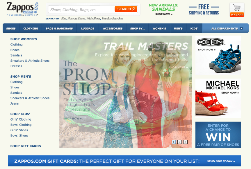
Zappos is using a scrolling banner with 3 kickers to the right. Try some combinations and see what works for you. Check out another variation of the banner / kickers combination at Diapers.com.
Tip: Keep an eye on seasonality, and switch out your kickers to display seasonal products at Christmas, Thanksgiving, Halloween and other relevant holidays.
Featured product boxes
Displaying best selling products directly on the home page is a sure fire way to increase conversions and get people directly into your product pages. List them directly beneath the banner and category kickers.
Showing best sellers by category allows you to have multiple products in front of the customer right there on the home page. Tabs save space and get a lot of information in front of the customer (see the Disney Stores tabs along the left of the featured products), but they’re not necessary – you can list them down the page, or you can put 3 or 4 of your best sections in tabs, then list a couple more down the page.
Tip: Base the categories and products you choose off of your Google analytics data on interaction and sales. ‘In page analytics’ lets you see the most popular categories and links that people click on. Site content -> all pages gives you the pages that people visit most often. Use these to create offers and banners to link people directly through to them.
The rest of the page
Finish off the page with a lot of information rich content. Give the people all the information they came to the home page to find out and drive home the sales.
Put up a ‘hello’ video from the owner. Tell the visitors about your company and yourself, guide them around the site and make some recommendations and purchase suggestions. This helps to build trust, give personality to your brand and can increase conversions, because people like to buy from people they know and have a connection with.
List a selection of good testimonials, from products you sell throughout the store. Display information about why people should buy from you and upload featured product videos and other educational videos.
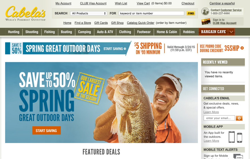
Also make sure to feature your special offers, because visitors go to the home page to look for special offers. Make sure they are being displayed there. A great example of a store utilizing home page special offers is Cabelas – see if you can draw inspiration from them.
Implement the changes, and test the results!
Once you’ve added your home page conversion boosters, make sure to test your results and make the right decisions for your products and industry.
And remember, when in doubt, check out what the big stores are doing. They are leaders in the field for a reason and have huge marketing budgets. Learn from the pros and reap the rewards of their extensive testing.
Tip: While the above information works the majority of the time, there are always industries that it doesn’t work for. Try all of the conversion boosters against listing products only (no conversion boosters at all). In some markets, just listing the products alone will convert better, so try it out and see what works for you.
Now that you have your home page dialed in, it’s time to learn what we can do to improve conversions on your product detail pages.
More On Related Topic
Explore our highlighted blogs for the latest insights and trends in the industry.
Logo Design: How Will It Affect Your Business and SEO?
E-commerce Logo Design Strategies and BeyondWhether you like it or not, the reality is, your logo will affect your business. It gives people a quick visual to identify your company and works harmoniously with...
Top Automotive Marketing Agencies to Drive Your Dealership’s Success
Automotive Marketing Online Agencies - Digital Marketing and AdvertisingFor any of you who may have come across the much celebrated TV series Mad Men, the days of suave smoking, cocktail drinking advertising executives are...
25 Best Niche eCommerce Site Ideas
Finding Niche eCommerce Website Ideas: Best Business SitesFinding a niche market for your ecommerce business ideas requires a dash of creativity as well as grinding keyword research, a bit of luck, and the right...

Ready To Grow Your Business?
Ready to elevate your aftermarket eCommerce presence and conversions—across auto, truck, powersports, marine, and more? Connect with
Web Shop Manager for tailored solutions: strategy, platform, and performance in one team.

