Apr 14, 2015 | 8 Min Read
Ecommerce CRO Series Part 5: Category & Section Page Conversion Boosters
Get in touch with us
Reach out to us for any inquiries or support, and let’s connect!


5 Ways to Increase Your Ecommerce Conversion Rates on Your Category Pages
Now that you have your product pages optimized for conversion, we’re going to take a step back and optimize your category or ‘section’ pages.
In case you missed it, we have already covered site wide e-commerce conversion and home page optimization, so go back and check if you haven’t yet. If you’re up to speed, then let’s get going.
Category pages are important for conversions
First let’s think about the purpose of a category page. A potential customer lands on your store and she already knows she is interested in buying shoes – she just doesn’t know which shoes yet and wants to look around.
She sees a link that says ‘Women’s Shoes’ and she clicks on it. Here she is presented with a series of choices. Pumps, Stilettos, Sandals, Sneakers, Boots…
She wants a pair of casual shoes, so she clicks ‘Sandals’ and up come all the Sandals that are available in store.
Now, as a storeowner, what is our purpose here?
We want her to choose a pair of shoes and buy them from our store. We do not want her to bounce out of the store and go to look somewhere else.
The purpose of the category page is to drive customers deeper into the store. We want them to either:
- go deeper into the product pages (where your product page optimizations will convince them to buy)
- or navigate to another category and choose products from there instead.
At no point do we want them to go backwards from here, or go to check out one of your competitors.
Now that we’re clear, here are some sure fire (tested) ways to get more people clicking through from your category pages to your products.
1) Test the number of items across
Many standard e-commerce templates come with 4 items across in the category page, but we have found experimenting with the number of items you display horizontally can have an effect on your conversions here.
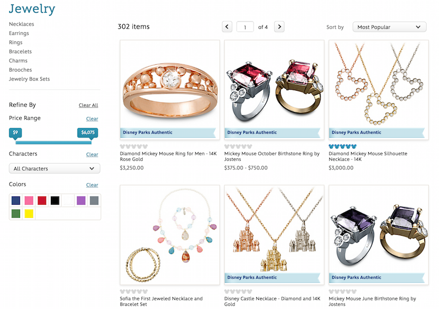
Crate and Barrel are notorious split testers, and they are currently working with 3 items across in their category page, as are The Disney Store. If you check back periodically, you will find that the number of items varies, as they test for the best number. Not long ago, Crate and Barrel were testing 5 across.
They test because it makes a difference, so try testing in your store to see what converts best for your product or industry.
2) Give people a reason to buy: Display price and sale price
When listing your products, consider the fact that people love to get a good deal when they are shopping. When they browse your store or your competitors, they are looking for a reason to buy from you – give them one.
The first basic optimization is to display both the original price and the ‘sale’ price. If you don’t want to have your items on sale, you can simply raise the original price and set the sale price as the price you want to sell it for.
Seemingly a tiny change, actually this little psychological difference can give your customers the reason they are looking for to choose you over the competition. People want to feel like they are getting a deal.
If you look at sites like iherb.com, you’ll find almost all of their items are ‘on sale’ all the time. We’re not suggesting you do the same, but displaying a sale price on a range of your products is a great way to get people from the category page into your product pages. Crate and Barrel also use this to great effect.
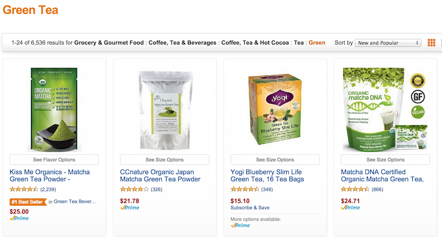
3) Be proud of your products: Show ratings and reviews
Another great way to show people the quality of your products is to display a star rating or overall number of reviews right next to your price and sale price.
Displaying a star rating and reviews gives instant social proof to your item, and subconsciously tells people that they are not alone in considering this purchase. If the star rating is high, all the better.
The message is clear: people bought this before and they thought it was good.
For great examples of this in action, there’s no better place than Amazon. A quick look at their ‘Green Tea’ category page and we are met with a whole list of items that have all been bought and rated by previous customers. We may not click on all of them, but we are bound to check out some – and that’s the point of a category page.
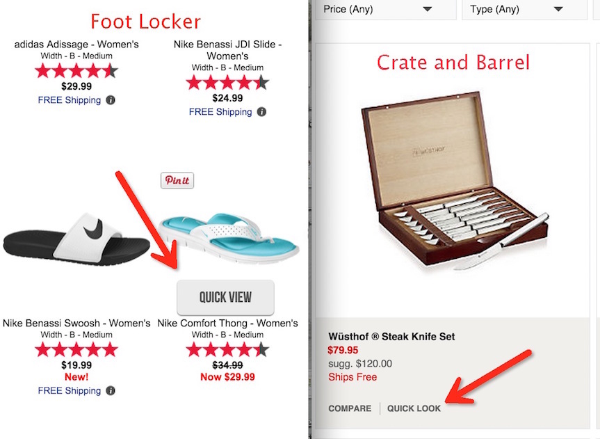
4) Keep customers on the page by using a quick view
Sites like Foot Locker, The Disney Store and Crate and Barrel are all doing a really good job of offering a ‘Quick View’ option on their category pages.
They know that offering people the option to quickly check the details and ‘have a closer look’ at a product without leaving the page enhances the browsing experience for their customers. It also reduces the chance of them leaving the store if they click on a product they don’t like.
It’s the equivalent of pulling a dress out from a rack of dresses to see how it looks and feels, without having to commit to taking it off the rack and trying it on.
People want to browse, and the quick look option allows them to conveniently look through each of your products before making an informed decision of which items to go ahead and buy.
They have the option to ‘add to cart’ and buy directly from the quick look pop up, or they just click ‘x’ and keep on browsing the category page.
5) Feature an item or bundle deal at the top of the page
Traditionally e-commerce stores would have a title and a little bit of text above the items in the category page, but more and more store-owners are catching on that the space can be put to better use by advertising a featured product or bundle deal.
Use the space below your products to display your text (it’s useful for SEO and people who want to ‘read more’) and keep that prime real estate above the fold for offers and specials.
People are likely to take advantage of the deal that you place in front of them, so use your Google analytics or other tools to choose a product that is popular or that you want to push to your audience.
Another idea is to choose a product that you have better margins on, or extra stock and want to sell more of.
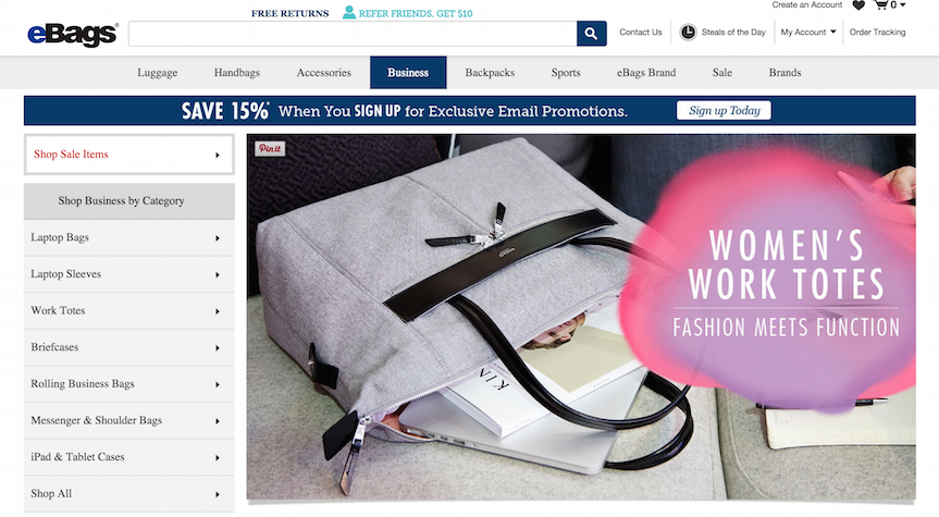
These deals and bundles work much better with ‘larger’ categories, such as ‘Bags’, rather than more narrow categories such as ‘Work Totes’ or ‘Laptop Sleeves’. By that point, people are already quite specific about what they want, so you can use the whole page to display your range.
Ebags.com is using this method to good effect, displaying an almost full-page ad at the top of all their big category pages, leading customers to check out a more specific range of bags that might interest them:
Remember the point of a category page
Finally let’s round it up by re-capping the main point of your category pages. The goal is to keep people moving through the store and into your product pages, where your product page conversion optimizations will start to do their work.
The five conversion boosters above have been tested to work, but we encourage you to test for yourself and see what works best for your market.
If you have any great conversion boosters to let us know about, just drop them in the comments below – we can’t wait to hear about what works for you!
PS. Stick around for the final installment of the e-commerce conversion rate optimization series, coming up in June: Cart and Checkout Optimizations

More On Related Topic
Explore our highlighted blogs for the latest insights and trends in the industry.
5 Essential Tips for SEO-Optimized E-commerce Product Images
Increase sales with clear eCommerce Product ImagesThe imagery on an eCommerce website is extremely important to the amount of success, and conversions, that site will generate. The customer does not have a tangible product...
Improve Conversions with Ajax One-Step Checkout: Shopping Cart and My Account Views
AJAX One Step Checkout Shopping CartWhen I first heard that Web Shop Manager was upgrading to a one step checkout, adding to an already awesome eCommerce web software, I thought to myself, why? What is a 1...
How to Plan and Reduce Customer Acquisition Cost: Your Essential Guide
Strategy for Customer Acquisition: Plan and Reduce CostsA customer acquisition plan is an aspect of marketing that takes time to cultivate, and you’ll want to give it a little room to develop so that...
Ready To Grow Your Business?
Ready to elevate your aftermarket eCommerce presence and conversions—across auto, truck, powersports, marine, and more? Connect with
Web Shop Manager for tailored solutions: strategy, platform, and performance in one team.