Jan 12, 2015 | 8 Min Read
Ecommerce Conversion Rate Optimization Series: 10 Site-Wide Conversion Boosters
Get in touch with us
Reach out to us for any inquiries or support, and let’s connect!


How to increase your eCommerce conversion rate part 1 (site wide)
Beginning our blog series on conversion boosters, we’re going to start by talking about tactics that work site-wide.
Each conversion booster alone has been shown to have a positive effect on conversions in most cases, so using multiple tactics from this blog and the following series may help you to see a compounding effect on your conversions. In some cases conversions have been known to double or triple by using all of the tactics listed in this series, but it depends from niche to niche and store to store.
You don’t have to use all of these boosters, but we encourage you to use as many as you think are relevant and have a positive effect in your industry. They can be implemented in any order.
Let’s get going!
Ecommerce conversion flow
Before we talk about specific conversion boosting tactics, it’s first important to understand ecommerce conversion ‘goal’ flow. Our intention is to get people to move through the ‘system’ of our store.
The most common metric to track is how many people who land on your product pages end up adding something to their cart, and from there how many go ahead and buy something. Another common one is to zoom in on the cart to sale ratio.
Understanding the importance of these metrics is to emphasize the point of what we are trying to achieve with these conversion boosters. We want to move people from the home page or the blog into a category page, from there to a product page, and from there to the cart and finally to a sale.
First things first: Search is your best friend
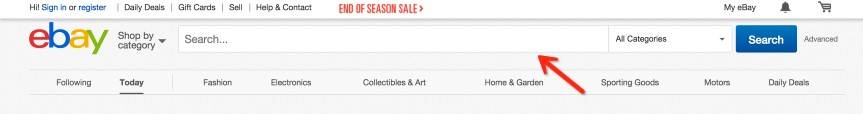
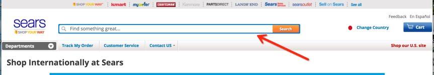
When you look at big ‘top ten’ ecommerce stores like Ebay, Amazon, Sears and Zappos you’ll see they all have one thing in common. They all have a really big, prominent search boxes right in the header.
They have discovered that people who search, buy. If you are familiar with Robert Cialdini’s consistency and commitment principles, you’ll know that if you can get someone to take a small action with you they are much more likely to take a bigger action in the future.
Baiting people into using your search bar by displaying it prominently in the top, center of your store is a great way to get that first successful ‘action’ with you potential customer, rendering them much more likely to buy from you.
A secondary benefit of increasing the number of searches made on your site is that searches reveal ‘hard to find’ items. Once you see what people are searching for, you can use that data to feature those items in deals and promotions.
The power of the ‘double header’
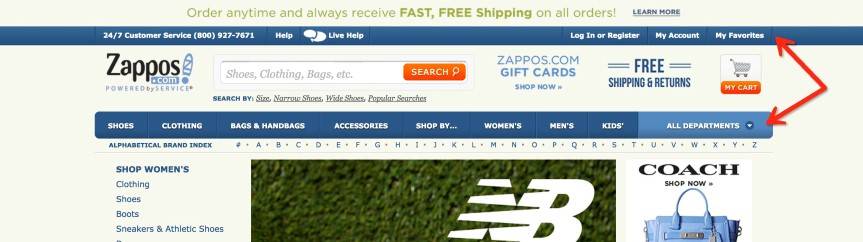
Zappos was one of the first stores to adopt this technique and since they did, it has spread throughout the ecommerce world like wildfire.
If you look at their store, you’ll see a header above the logo, which contains information such as a contact number, customer support, account log in and favourites. Then you have a kind of ‘sandwich’ section with the logo, search bar, a USP or guarantee (currently free shipping) and an offer of some kind (currently promoting Zappos gift cards).
Below that, you will see a second header. This acts as the main navigation for the store. Having freed up space using the first header for more ‘informational’ pages, the second header can be fully utilized to add links to more ‘juicy’ pages such as categories, special offers or any other important pages you want to guide customers to.
The double header really works, as it gives you as a storeowner a permanent place to put a lot of information in front of the customer, which will appear on every page. The best part is that it is done in a very non-intrusive way and is also very convenient for the customer, improving user experience.
Optimizing the header
Once you have your double header up and running, you want to make sure you include some certain things. People expect the logo to be in the top left, so make sure that is there, and they expect the cart to be in the top right. Also make sure to have your store logo link back to the homepage.
Once those are in place, you should include your contact phone number, a login if you have it and make sure to include a guarantee of some kind. If you sell clothing you might guarantee a size or color match, or you may just follow the example from 1-800 Pet Meds and guarantee satisfaction!
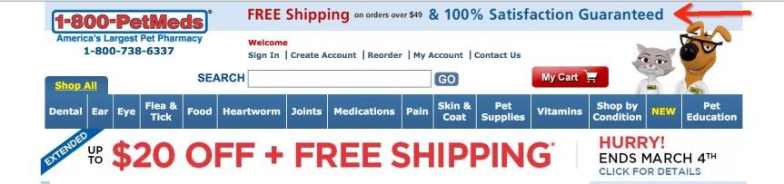
Next make sure to include an offer of some kind. A common offer to include is free shipping, whether conditional or not, or you may want to have a discount or seasonal offer in place. Just make sure to include your offer, as people expect it to be there and it’s a great place to get it seen no matter what page of your site people land on.
Lastly, include live chat if you have it. Live chat is a great way to connect with your customers and pick up sales from customers that may have left your store if they couldn’t find a way to get their question answered.
Remember not to clutter your headers too much. People can only focus on one element of a webpage at a time, and they scan around. Cluttering your header makes it hard to focus on the individual elements and prevents the information from standing out.
Further optimizations
While adding all the small optimizations to your header, here are a few more to add throughout the site as you go:
Favicon / Social Buttons: the favicon only needs to be done once, so do it well and leave it to do its job. Adding your social buttons to the header is also important. It lets people find your social pages easily. We’re talking Facebook, Twitter and Pinterest mainly, then Instagram, You Tube and whatever else works for you in your industry.
Video: Take the chance to add video throughout your store. Video works wonders for your conversions. People love to buy from people they know and trust, and video is a great way to get your voice, face and message in front of your customers.
FAQs / Educational Content: Let people know more about your company and products and keep them engaged. Add links throughout your store, wherever people may be looking. Get important ones in the header, and list all of them in the footer or side navigation if you can.
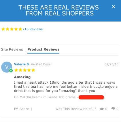
Randomly displayed testimonials: Testimonials can be collected via email auto-responders, using software such as Yotpo or via your social media pages and Amazon store. Once you have them, display them at opportune moments throughout your store. Glowing testimonials from happy customers do wonders for social proof, and social proof leads to conversions.
The footer: Make sure your footer is packed with info, just like the header. The footer can be more text based, as people expect to go there to find text links to the inner pages of your store.
Make sure to include your trust / secure shopping icons in the footer where you can and include your opt-in form, guarantees, links to categories and more information pages. You may even experiment with including a small search bar in the footer. The more options customers have to search with you the better!
Go forth and increase conversions!
That’s it for part one. Check out part two where we discuss many more conversion boosters to drive sales for your store.
As we said before, you don’t have to include all of these tactics. Using just one should see a noticeable increase in converting traffic. But use as many as you can, experiment and find out what works best in your niche!

More On Related Topic
Explore our highlighted blogs for the latest insights and trends in the industry.
3 Logical Steps to Select a Profitable Niche (SEO Guide)
Profitable Niche Business Ideas : How to find!When you take the time to build a quality e-commerce store, you have the opportunity to make a very decent living. And once people figure this out, they...
March 2017 Web Shop Manager Talks: Muse Awards, Upcoming Events, and New Website Features
March 2017 Web Shop Manager talks Muse Awards, upcoming events, and new website features.2017 started off with a bang and March has been no exception. We've got new site releases, upcoming events we'll be...
Top Automotive Marketing Agencies to Drive Your Dealership’s Success
Automotive Marketing Online Agencies - Digital Marketing and AdvertisingFor any of you who may have come across the much celebrated TV series Mad Men, the days of suave smoking, cocktail drinking advertising executives are...
Ready To Grow Your Business?
Ready to elevate your aftermarket eCommerce presence and conversions—across auto, truck, powersports, marine, and more? Connect with
Web Shop Manager for tailored solutions: strategy, platform, and performance in one team.