Jul 7, 2015 | 7 Min Read
Implementing Mobile Web Design: A Beginner’s 101 Guide
Get in touch with us
Reach out to us for any inquiries or support, and let’s connect!
Discussing ecommerce web design and the importance of responsive mobile websites and mobile web design for ecommerce platforms
It’s easy to get overwhelmed when you start implementing a mobile web design as part of your e-commerce strategy. We’re here to tell you – don’t overcomplicate it! It’s not as hard as you think. Once you get the basics down, you can build on them. But many turnkey e-commerce stores do just fine by focusing on the right designs and tools, and not letting themselves implement every tactic, strategy, and piece of advice that comes their way.
Be mindful of what you are trying to accomplish with your web design and it will be easier to narrow your focus on what really matters. Here we’ll explore the importance of implementing a mobile web design that will please your customers, search engines, and your brand.
The difference between mobile users and desktop users
You may not realize it, but there’s a big difference between mobile users and desktop users. One of the most important variations between the two is the number of seconds they spend on each page. Even if you use both devices (which most of us do), you’ll find even your habits change when using a smartphone versus a desktop.

People have more patience on their desktops than they do on phones. However, they still don’t have a lot! But when you’re sitting in front of your desktop, you’ll give that website an extra few seconds to load, or you’ll spend a little time learning the navigation system. On mobile devices, people aren’t going to stick around as long. If your e-commerce store doesn’t load fast and is difficult to navigate, people are going to leave before you even knew they were there.
Remember – your mobile web design is the first thing that customers see! Don’t let it be the reason they leave right away.
The importance of having a responsive website
A responsive website changes the layout of the site design depending on the size of the screen being used to search online. There are many reasons why a responsive web design is important, but in a nutshell, there are two crucial reasons: Search Engines and Customer User Experience.
Google ranks websites on mobile devices differently than they do for desktops. And custome
rs continually visit sites that are easy to use and engage on. It’s truly that simple.
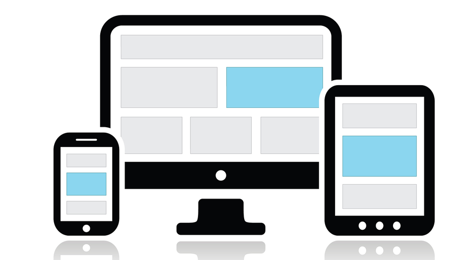
Types of responsive mobile web designs
Here we’ll look at two types of mobile responsive websites you can have. First, you can choose to have a responsive site for mobile devices, which means you will have the same design across desktops, tablets, and smartphones. The responsive options will often come with the design theme right out of the box. It makes it simple for you to click a button, make a few small adjustments, and boom — your website is responsive for the mobile web. This is an inexpensive and simple option that works for many e-commerce business owners.
Another approach is to create a separate site for mobile devices. This will allow you to optimize your e-commerce store for smartphones and design it separately from the e-commerce theme you use for a desktop. Sounds like twice the work? It is, and it’s more expensive, but for some people it’s worth it when they’re ready to take an advanced leap into mobile web design.
Steps to take for an effective mobile web design
Now that you know you need a responsive web design for mobile devices, there are a few more steps you need to take. A responsive website is great, but it isn’t enough.
#1: Simple navigation is the key to success. Keep in mind the size of smartphones. You don’t need things like multi-level menus that can be difficult to click on and you shouldn’t have to use keyboards often. People are used to swiping and tapping when it comes to phone navigation, so keep that in mind.
Your website’s interface needs to be clean for people to know where to go to next. Use arrows to alert customers where to swipe and tap. Honestly, don’t assume people know how every design should be navigated. The more you guide them, the more people will follow and appreciate your design.
#2: Remove unnecessary images. Give the people what they need – not what they want. (Okay, give them a little of what they want.) But your main focus for implementing mobile web design is the less-is-more approach. Pretty just isn’t as important when people are searching on their phones. Images are one of those factors that can slow down your site and they may not respond accurately to all mobile devices. If it doesn’t sell your product or your brand, ditch the image.
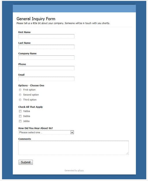
#3: Make online forms easy to use. Nothing will make someone abandon their cart faster than having to fill out a detailed form on their phone. Use top aligned labels for forms because they’re easier on the eyes and consumers prefer them. Auto fill as much of the information as you can and have an option for the form to be sent to their email, so they can fill it out once they get to their desktop.
#4: Have a clear message. When you lack focus, it is more noticeable on mobile devices than it is on a desktop. Although, some designs on desktops can be pretty scary because there is no clarity as to what they sell. If your e-commerce store sells active outdoor clothing and gear, then it should be clear on the first page. A cluttered message will send people to your competitors.
#5: Measure your layout in percentages, not pixels. In order to have a smooth design on all devices sizes, your layout should have fluidity. When you set the image size in percentages rather than pixels, everything will adjust to the size of the screen.
Beyond the basics
Once you have grasped the basics of an effective mobile web design and have implemented the tactics above, you should start seeing your bounce rate go down, and your conversion rate go up. Stay tuned for more on how to gain extra traction for your e-commerce store on the mobile web.
Until then, check out your competitors, favorite stores, and successful e-commerce shops using your smartphone. Make a list of what features you like to get a better understanding of web designs that work. Also make notes of the ones that make you want to throw your phone at a wall, so you know what to avoid.

More On Related Topic
Explore our highlighted blogs for the latest insights and trends in the industry.
The Definitive Guide to Ecommerce Category Trees: Strategy, Build, and Future-Proofing
How to build a high performance Ecommerce category treeAre you confident your Ecommerce store’s category tree is driving as many sales as it should be? Could it be losing you sales?After years of working...
What Makes a Great Website: Optimizing Images for Success (Part 1)
What Makes A Great Website Part 1 | Web Shop ManagerIt is always important to have high quality images on your site. Although content is considered king and is the most important aspect of...
Mastering Website Metrics: Essential Google Analytics Tips (Part 2)
Web Shop Manager - Using Google Analytics Part 2Google Analytics Metrics & How You Can Improve Yours!Having a deep understanding of what your Google Analytics account is telling you through all the different data...
Ready To Grow Your Business?
Ready to elevate your aftermarket eCommerce presence and conversions—across auto, truck, powersports, marine, and more? Connect with
Web Shop Manager for tailored solutions: strategy, platform, and performance in one team.