Apr 8, 2014 | 3 Min Read
5 Benefits of Responsive Web Design (And Why They Matter for SEO)
Get in touch with us
Reach out to us for any inquiries or support, and let’s connect!


It is becoming increasingly more difficult to have a successful online business today without utilizing responsive web design. If you want to stand apart from your competitors and make more money, it is crucial to make your site responsive and ensure that anyone can access your site from any device. This article will outline the benefits of responsive web design and how it can help your business achieve more and reach more customers.
Consider this infographic from Digital Buzz Blog:
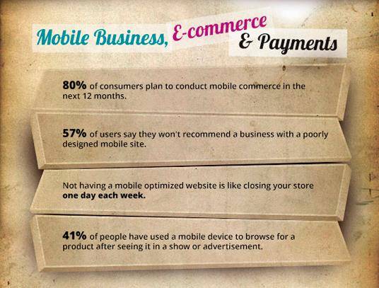
These statistics are huge, and are geared only to go up in 2014. With mobile device users numbering in the billions worldwide – why wouldn’t you want to make sure your site looks great on any screen size?
What is responsive web design?
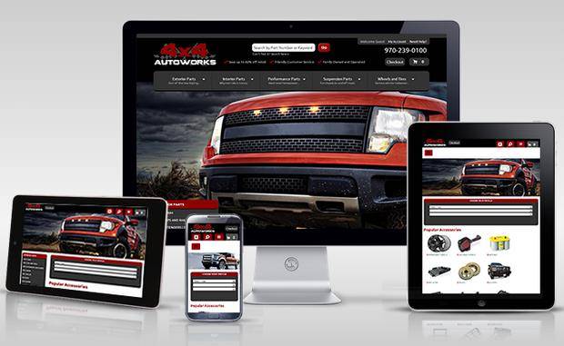
Responsive web design is just as the name implies – responsive. When a site is built with a responsive framework, the content, images, and structure of the site responds to the screen size of the device that is accessing it. This means that your site will look similar in any device, and when there is less room, the structure of the page changes to fit the new space the site is contained in.
Why do I need a responsive website?
- Google Says So. If you ask Google’s Developers and Webmasters, they actually recommend using responsive web design due to the benefits it will give you. It will consolidate your site so you do not need a separate mobile URL, giving you one easy to manage site.
- SEO Value. Maintaining a desktop friendly site and a mobile friendly site means duplicate content which Google hates. By having one responsive site, anyone can access the same content on any device and it will look great no matter what the screen size is.
- Better User Experience. Instead of shrinking text and images to fit to the screen and maintaining their original structure, responsive web design lets your site move and bend and fit into the frame provided, giving your users a site that is easier to read and navigate.
- Staying Ahead. Not many sites currently utilize responsive web design. By making your site responsive, you will stay ahead of other businesses who do not want to invest in this technology yet. People are starting to catch on and by the end of the year, almost all websites will be responsive to keep up with the growing number of mobile phone and tablet users.
- Staying In Business. Without a responsive website, you are losing customers and losing money. People buy more products online now than they do in stores. Why go out in the cold or the heat and waste gas when you can sit at home and have your products delivered to you? By not having a responsive web design, you are not catering to a large portion of your potential market and in the process losing money and business.

More On Related Topic
Explore our highlighted blogs for the latest insights and trends in the industry.
What Makes a Great Website: Optimizing Images for Success (Part 1)
What Makes A Great Website Part 1 | Web Shop ManagerIt is always important to have high quality images on your site. Although content is considered king and is the most important aspect of...
Improve Ecommerce Product Data Accessibility for Customers: An SEO Guide
Best SEO eCommerce Product Data and Description for your CustomersIf you own an e-commerce store, you’ve probably noticed that the competition is pretty tight these days. Owners have captured some impressive data for marketing...
How Product Descriptions Impact Ecommerce Marketing & Sales
eCommerce Product Descriptions Enhance SEO EffortsThere is so much that can be done on the web to promote your eCommerce site and your online products, but often business owners will forget one of the easiest and...
Ready To Grow Your Business?
Ready to elevate your aftermarket eCommerce presence and conversions—across auto, truck, powersports, marine, and more? Connect with
Web Shop Manager for tailored solutions: strategy, platform, and performance in one team.