How to increase performance with ecommerce category trees
Let’s build the tree! (Action Steps)
How to build a high performance Ecommerce category tree (for faster and more frequent purchase decisions) - Part 3/4: Action time! Let’s build your tree
Action Steps: Building your high performance category tree
Now that we have our information prepared to get the best results, let’s start building your category tree.
Think of the following sections hierarchically.
Your main categories will be at the top of the tree, and they will be fewest. Under that will come your subcategories, levels 1, 2 and perhaps 3, and will number higher than your main categories. Finally, you will have set of filters that narrow down the search to the very most specific details of the product.
When it’s done, it will look like a Christmas tree, thinnest at the top, and widest at the base, like this
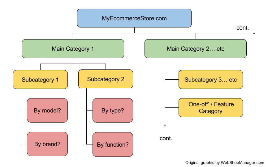
An example of how your Ecommerce category tree should start to look. Less main categories, more sub- and sub-sub-categories.
Main categories
These are your biggest, broadest product groupings. The idea of these categories is to quickly display to new visitors the total scope of what you stock in your store.
If your potential customer is looking to pick up a rear bumper, and your main categories are bumpers, floor mats, lighting and a other cosmetic automotive accessories, they’ll dive right into ‘Bumpers’ and find what they need in a couple of clicks.
However, if you have that same set of main categories on your site, but this time your customer wants to pick up some electronic components in bulk, and you do stock them, but ‘electronics’ isn’t in your main category list… they’re going to bounce to your competitor immediately, because they think you only do cosmetic accessories.
Now you’ve missed a sale.
Your ideal situation here is that every major product grouping has a ‘main category’ allocation right at the top of the tree.
They should simultaneously outline what you do and do not stock, and intuitively lead your customer down the right path to find what they want to buy.
REI do a good job of breaking down their main categories, within the wider range of ‘Outdoor Gear’
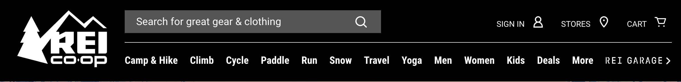
The clear breakdown of REI’s main categories clearly sets the boundary of what they do and do not stock.
Subcategories
This is where you break down your main categories into specific groups of products from which customers can compare and select the products they want.
We recommend that you stick to 1-2 levels of subcategories, to stay within the ‘3 clicks to buy’ framework. This will vary if you have especially large inventories.
To use an automotive example, this is where you break down your ‘Bumpers’ main category into front bumper and rear bumper, and your floor mats into a list of brands or soft vs. hard (depending on how you choose to present your range).
A clothing store might break down their T-Shirt range into v-neck, long sleeve and short sleeve, or their jeans into skinny fit, bootleg, straight cut and low rise.
In general, the subcategory level is too early to go into things like size and material, as listing all those variables in your main navigation would be far too overwhelming for most shoppers.
Your goal is to draw customers to the right product grouping, then allow them to play with size and material options to isolate the exact product they are interested in.
Web Shop Manager client Jack’d Offroad do a great job of breaking down their main categories (in this example, ‘Drivetrain’) into more manageable subcategories

Break down your main categories into clear subcategories make products easier to find, compare and purchase
’Feature’ categories
Your feature categories are unique groupings that fall outside the normal range of attributes that you use for your main and subcategories.
Examples of this are sale or discount items, limited edition ranges, best sellers and new in stock.
You won’t want to use all of these as you may risk confusing your audience and devaluing your product range. Choose a few that are most likely to work well for your business.
It might be useful to place them in the main navigation, right next to your main categories (such as ‘Discount Items’ to catch people who are shopping for a bargain) or you may wish to place a few permanent links, such as ‘Best Sellers’ or ‘New Items’ in the top bar or footer.
Placing them in a permanent, visible, yet non-intrusive spot such as the top header will create familiarity with your regular customers, who are likely to routinely check back to see what you are offering there.
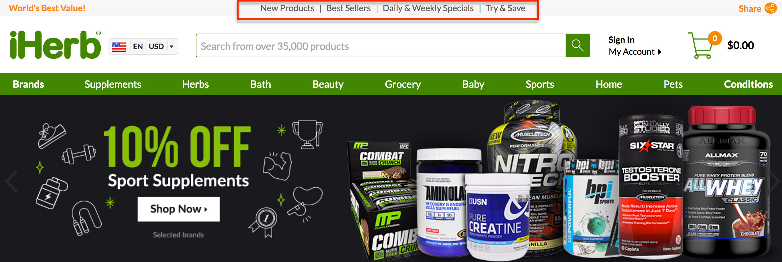
Herb.com permanently display their specials, best sellers and new items in the top navigation bar, to train customers to check back regularly for deals.
This works for seasonal lines, such as Xmas and Halloween, and you can link directly to the category from banners on the main page, or include them in the navigation.
Pottery Barn, a leading Ecommerce store well-known for their split-testing and high conversions, place featured products prominently in the drop down menus.

Displaying featured categories in the drop down menus works for Pottery Barn, who are dealing with very large inventory.
Filters & Tagging
Product filters really dig down into the specifics of your product attributes.
Let’s say we have already attracted our buyer into the category ‘Bumpers’, and they chose to continue on the search into ‘Rear Bumpers’, which they know they need.
When they reach this section, they most likely still have many questions about which product they want to buy and we can help them answer those questions with filters.
Often appearing on the left side of the screen, perhaps as drop down menus, check boxes or slider bars, customers can easily refine their search using the parameters you set.
Zappos, who are dealing with a huge inventory, use checkbox filters on the left of their category page screens.

Zappos using checkbox filters to organize their large inventory into manageable product groupings.
In the image above, Zappos use several ‘product specific’ filters such as features, strap or handle style, closures and pattern to narrow down the search for Carry On Luggage, which in total has 444 items.
You may choose to offer filtering of maximum price, minimum price, size, color, brand, model, age, application, style, customer rating or any other attribute that applies to your product range.
Our hypothetical customer can choose to refine their search in rear bumpers using color and price, because they know their budget and color of their car.
This will bring the number of applicable products in category down to a manageable number, which the customer is able to compare, contrast and make a purchase decision.
Here I narrowed down my Zappos ‘Carry On Luggage’ search to four items, using just two check boxes: small and burgundy.
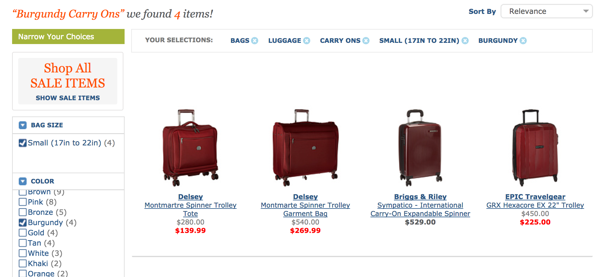
Offering search filters on category pages makes it easy to narrow down a large volume of inventory and make a purchase decision.
If your customer feels they have narrowed the search down too far (perhaps they don’t like any of the options, or there is not enough of a range in that narrow of a search) they can easily re-adjust the filter parameters, perhaps increasing the maximum price to see what products are available if they spend a little more.
Had we provided all these options as subcategory options, the customer would most likely have never gotten down to product level on their purchase journey.
How do I make sure my tree is performing at the highest level?
Check out our next and final post in the series, where we take a look at some ways to make sure your newly built tree is tuned in and optimized for high performance.
Have questions building your tree? If you need help, let us know in the comments below!
BEDSLIDE - Client Testimonial
"The best thing out of everything was that our sales went up. The new site had a better design, the checkout process was better, and ultimately achieved all of our goals. That site has been up for a year and a half and we’re very happy with it, it’s still awesome." - Jake Plappert