Ecommerce Tips: 2 Simple Web Design Fixes That Will Amp Up Your ROI
When customers think about your web design, they think of attractive fonts, vibrant colors, and stylish images. But as a web designer, you have A LOT more to think about. An effective website design strategy starts and ends with research, using all of the tools available at your disposal.
You not only want to entice the visitor to come to your site, but you want them to stick around and convert – and this takes a user interface that is easy to navigate, has fast upload times, and doesn’t waste customers time.
Here are a few simple fixes that you can apply to your web design to ensure you're giving customers what they need.
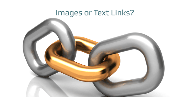
#1: Images versus links – choose wisely!
When it comes to links and images, you want to be sure that your web design is responsive and on point for all sizes of screens. What looks good on a large screen won’t always come across on a smartphone.
And even if the link looks attractive on a tiny screen, if it isn't easy to click on, people either won't or they'll end up hitting the wrong link, get redirected, and bail on the site.
While images are easier to click on, it isn't always clear that they lead you to the next step if you don't pair it with a call-to-action. Plus, too many images can slow down site speed.
So what’s the simple answer?
You need to find out what works best for you and your site speed, so try doing some split testing and see what your click-through rate is for links versus images. Once you've got that info, the choice will easy.
#2: Focus (just a little) less on what your customers want
We all know the old saying the customer is always right. And while you want to give people a satisfactory experience, when it comes to the interface of your web design, you’ll want to focus on guiding customers rather than listening to them.
People don’t want to think too hard about what to click on next, how to go about making the purchase, and if they are on the right page.
And you don’t want to leave them second-guessing and unsure about converting.
Give your customers credit, but not too much credit. Lay it out for them clearly so they understand the next steps you want them to take. You can even be as direct as using arrows to guide them or steps written out that say something like:
Step 1 Choose a product and click on the image
Step 2 Provide payment and delivery information
Step 3 Review and confirm
Step 4 Click the complete button and enjoy!
While it might seem like a no-brainer to the savvy online shopper, you might be surprised how many abandoned e-commerce shopping carts are due to lack of direction.
Get started today making life a little easier for your customers and you'll see those conversions start to incline.

BEDSLIDE - Client Testimonial
"The best thing out of everything was that our sales went up. The new site had a better design, the checkout process was better, and ultimately achieved all of our goals. That site has been up for a year and a half and we’re very happy with it, it’s still awesome." - Jake Plappert